The purpose of this article is to give you the keys to properly evaluate your binary classification model. For that I would quickly go to the essential because the goal is not to determine how to choose such or such algorithm but to evaluate its relevance. Don’t worry because the choice aspect will of course be the subject of a future article. Let’s see from the same data set and especially from the same work on these data how we must evaluate the execution of several models.
Index
We are already training our models
To do this we will start with the kaggle data of the Titanic (which I have already used several times in my previous articles ). Download them here if you haven’t picked them up yet. After some preparations, we will apply 3 different Machine learning algorithms:
- The classification “Dummy” (totally unnecessary in itself apart as a basis of comparison)
- the Logistic Regression
- the Random Forest
First of all the preparation of the data:
import pandas as pd
from sklearn.linear_model import LogisticRegression
from sklearn.ensemble import RandomForestClassifier
from sklearn.dummy import DummyClassifier

titanic = pd.read_csv("../titanic/data/train.csv")
def Prepare_Modele(X, cabin):
    target = X.Survived
    sexe = pd.get_dummies(X['Sex'], prefix='sex')
    cabin = pd.get_dummies(cabin.str[0], prefix='Cabin')
    age = X['Age'].fillna(X['Age'].mean())
    X = X[['Pclass', 'SibSp']].join(cabin).join(sexe).join(age)
    return X, target
cabin = titanic['Cabin'].fillna('X')
X, y = Prepare_Modele(titanic, cabin)
Once again, the objective here is not to explain how the data was prepared, I refer you for that to the article on the one-hot in particular .
Now let’s train our models, we thus obtain an overall scoring of:
- The classification “Dummy” : 53%
- the Logistic Regression : 81%
- the Random Forest: 92%
Precision & Recall
An overall scoring is good but when it comes to classification it is important to go further. Indeed if the classification is binary, the errors must be evaluated more closely because the importance of a false positive will not be the same as that of a false negative. You will probably even want to play the cursor between these two types of errors. But what is a False-Positive? and who of a False-Negative?
A False-Positive is a false positive prediction, a False-Negative is a false negative prediction!
Imagine being screened for some disease. A False-Positive verdict tells you that you are sick when you are not. A False-Negative verdict tells you that you are not sick… although you are. An overall scoring can be useful but what you will really want to measure is the False-Negative rate because it is this one that can have a big impact on your prediction.
In Machine Learning parlance, you’re going to want to maximize recall!
How to calculate the recall , and very simply using this formula:

As for precision, it is its counterpart:

A third element measures the f-measure indicator , allowing you to combine the two elements into one indicator:

The precision will allow us in particular to measure the capacity of the model to refuse irrelevant results.
Retrieve all these measurement elements simply with the classification_report (scikit-learn) method.
Confusion matrix
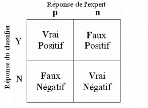
Now how do we just get those True-False Positives-Negatives back? Well, quite simply by using the Confusion Matrix.
Building this matrix is very simple because it represents precisely these 4 values:

Of course scikit-learn provides it to you very simply with the function confusion_matrix :
from sklearn.metrics import confusion_matrix
c_dm = confusion_matrix (y, p_dm)
print ("Matrice de confusion / Dummy\n", c_dm)
c_rl = confusion_matrix (y, p_rl)
print ("Matrice de confusion / Reg. Linéaire\n", c_rl)
c_tr = confusion_matrix (y, p_tr)
print ("Matrice de confusion / Random Foret\n", c_tr)
ROC and AUC curve
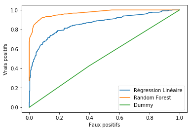
In order to bring a visual touch and above all to be more relevant in the analysis, an effective tool is the ROC curve. This curve allows you to see the rate of false positives versus true positives at a glance.
from sklearn.metrics import roc_curve
import matplotlib.pyplot as plt
faux_positifs_rl, vrais_positifs_rl, seuil_rl = roc_curve(y, lr1.decision_function(X))
plt.plot(faux_positifs_rl, vrais_positifs_rl, label="Régression Linéaire")
faux_positifs_tr, vrais_positifs_tr, seuil_tr = roc_curve(y, tree.predict_proba(X)[:,1])
plt.plot(faux_positifs_tr, vrais_positifs_tr, label="Random Forest")
faux_positifs_dm, vrais_positifs_dm, seuil_dm = roc_curve(y, dummy.predict_proba(X)[:,1])
plt.plot(faux_positifs_dm, vrais_positifs_dm, label="Dummy")
plt.xlabel ("Faux positifs")
plt.ylabel ("Vrais positifs")
plt.legend ()

To read it better, it is simply wrong to understand that the more the curve is squashed towards the Top-Left edge, the better the model! In our example it is rather obvious of course, but sometimes we will have to measure the area under the curve to measure precisely.
the area under the ROC curve is the AUC area.
To measure it, use scikitlearn’s metrics.auc method:
from sklearn import metrics
print ("AUC Dummy: ",metrics.auc(faux_positifs_dm, vrais_positifs_dm))
print ("AUC Reg. linéaire: ",metrics.auc(faux_positifs_rl, vrais_positifs_rl))
print ("AUC Random Forest: ",metrics.auc(faux_positifs_tr, vrais_positifs_tr))


