by
by Plotly is a company but more important it’s a well known library widely used in the Python (but not only 😉 world. Why ? because this library is quite advanced and allows you to make charts in a very simple and efficient way. If, you want to find out how it works, just follow the guide! In this article we will see how to install and use this library through various data visualizations. There is only one prerequisite: knowing a little bit about Python. On the environment side, I will use Google Colab.
Index
Installation
This is really one of my favorite things about Python … installing a new library is incredibly easy with pip:
pip install plotly
If like me you use Google Colab, you’ll get that message in return:
Requirement already satisfied: plotly in /usr/local/lib/python3.7/dist-packages (4.4.1)
Requirement already satisfied: retrying>=1.3.3 in /usr/local/lib/python3.7/dist-packages (from plotly) (1.3.3)
Requirement already satisfied: six in /usr/local/lib/python3.7/dist-packages (from plotly) (1.15.0)
Here is the library is ready to use, all you have to do is reference it via a few Python imports:
import numpy as np
import pandas as pd
import plotly.graph_objects as go
import plotly.express as px
from plotly.subplots import make_subplots
Dataset preparation
In order to visualize the different graphs we’re going to prepare a dataset from the one provided by default with Google Colab: /content/sample_data/california_housing_train.csv
This dataset (used in the second chapter of Aurélien Géron’s recent book “Hands-On Machine learning with Scikit-Learn and TensorFlow”). The data references homes found in a district of California and offers some statistics based on data from the 1990 US Census.
The columns are as follows, their names are quite self-explanatory:
- longitude et latitude
- housingmedianage
- total_rooms
- total_bedrooms
- population
- households
- median_income
- medianhousevalue
All this data does not really interest us, from this dataset we will create two new datasets:
- A aggregated dataset by median age
- A aggregated dataset (even more aggregated in fact) by median age category (for this we will create a new categorical data allowing to group the median ages)
Let’s get this dataset first. As I told you, this game is offered by default in colab:
dataset = pd.read_csv("/content/sample_data/california_housing_train.csv")
dataset.head()
	longitude	latitude	housing_median_age	total_rooms	total_bedrooms	population	households	median_income	median_house_value
0	-114.31	34.19	15.0	5612.0	1283.0	1015.0	472.0	1.4936	66900.0
1	-114.47	34.40	19.0	7650.0	1901.0	1129.0	463.0	1.8200	80100.0
2	-114.56	33.69	17.0	720.0	174.0	333.0	117.0	1.6509	85700.0
3	-114.57	33.64	14.0	1501.0	337.0	515.0	226.0	3.1917	73400.0
4	-114.57	33.57	20.0	1454.0	326.0	624.0	262.0	1.9250	65500.0
Now we can create our two aggregated datasets :
def group(age):
  if (age < 10):
    return "0-10"
  elif (age < 20):
    return "10-20"
  elif (age < 30):
    return "20-30"
  elif (age < 40):
    return "30-40"
  else:
    return "40+"

# Create an aggregat by age group
ds_grp_age = dataset
ds_grp_age["agegroup"] = [group(x) for x in ds_grp_age["housing_median_age"] ]
ds_grp_age = ds_grp_age[['agegroup', 'median_house_value', 'median_income', 'total_rooms', 'population']]
gpr_age = pd.DataFrame()
gpr_age["value"] = ds_grp_age.groupby(by=['agegroup']).median_house_value.mean()
gpr_age["age"] = ds_grp_age.groupby(by=['agegroup']).agegroup.max()
gpr_age["income"] = ds_grp_age.groupby(by=['agegroup']).median_income.mean()
gpr_age["rooms"] = ds_grp_age.groupby(by=['agegroup']).total_rooms.mean()
gpr_age["population"] = ds_grp_age.groupby(by=['agegroup']).population.mean()

# Create an aggregat by age
ds_age = dataset
ds_age = ds_age[['median_house_value', 'median_income', 'total_rooms', 'population', 'housing_median_age']]
agg_age = pd.DataFrame()
agg_age["value"] = ds_age.groupby(by=['housing_median_age']).median_house_value.mean()
agg_age["age"] = ds_age.groupby(by=['housing_median_age']).housing_median_age.max()
agg_age["income"] = ds_age.groupby(by=['housing_median_age']).median_income.mean()
agg_age["rooms"] = ds_age.groupby(by=['housing_median_age']).total_rooms.mean()
agg_age["population"] = ds_age.groupby(by=['housing_median_age']).population.mean()
agg_age["agegroup"] = agg_age["age"].apply(group)
Basics Viz
Scatter plot
The first chart’s type we think of when we have two continuous data types is of course a scatter plot. With plotly nothing could be simpler:
fig = go.Figure(data=go.Scatter(
                  x=agg_age["age"],
                  y=agg_age["value"],
                  mode='markers'))
fig.show()

Plotly’s interest does not end here. First, the graph is quite interactive: just hover the mouse over the points and you will see information (the coordinates) displayed in a tooltip:

Secondly, you will probably have noticed that at the top right there are several buttons:

These buttons allow more possibilities for interaction with the user:
- Download the graph in png
- Zoom in
- Move the graph relative to its default axes
- Select items
- Reset axes
- etc.
Line chart
Of course Plotly offers more advanced functions to create graphs and combine several in one. To combine several graphs together, just stack calls to the add_trace () function. Let’s see how to simply create 2 line graph together.
fig = go.Figure(data=go.Scatter(x=agg_age["age"], y=agg_age["population"], mode='lines+markers', name='population'))
fig.add_trace(go.Scatter(x=agg_age["age"], y=agg_age["rooms"], mode='lines+markers', name='rooms'))
fig.show()

You will also notice that Plotly automatically changes the color.
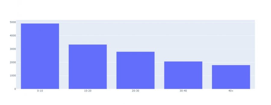
Bar Charts
Whenever we have categorical data with continuous data, we often use bar charts:
fig = go.Figure(data=go.Bar(x=gpr_age["age"], y=gpr_age["rooms"]))
fig.show()
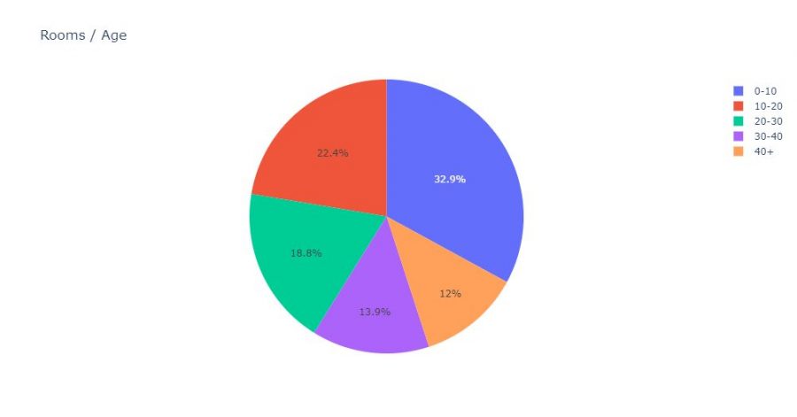
Pie Chart
Pie charts are not really more complex:
fig = px.pie(gpr_age, values='rooms', names='age', title='Rooms / Age')
fig.show()
More advanced Data Viz
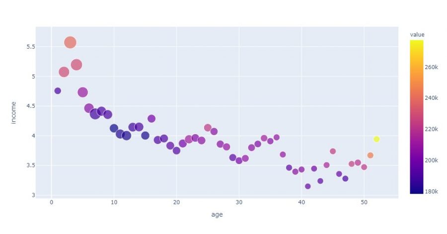
When we visualize data on a slightly more complex dataset we can play on 3 (or even 4) elements:
- The coordinates (what we did previoulsy)
- Its thickness
- Its color
- and sometimes even the shape (of the point)
Let’s see how to build a more fleshed out visualization with Plotly. For that we just have to add the color and size attributes with the columns to visualize in the graph. We will even add some additional information in the info bubble (population):
fig = px.scatter(agg_age,
                 x="age",
                 y="income",
                 color="value",
                 size='rooms',
                 hover_data=['population'])
fig.show()
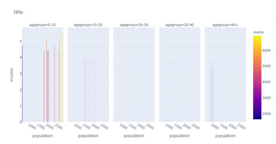
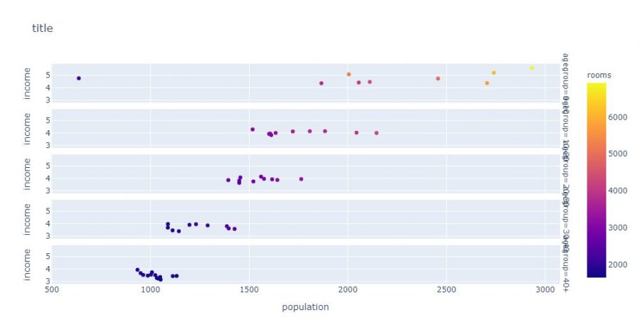
With Plotly, you can also stack several graphs which will automatically decline via categorical data for example. In the example below Plotly will create as many separate graphs as there are age rump:
fig = px.bar(
    agg_age,
    x="population",
    y="income",
    color="rooms",
    facet_col="agegroup",
    title="title"
)
fig.show()
The stacking can also be vertical, so we use the facet_row attribute instead of facte_col:
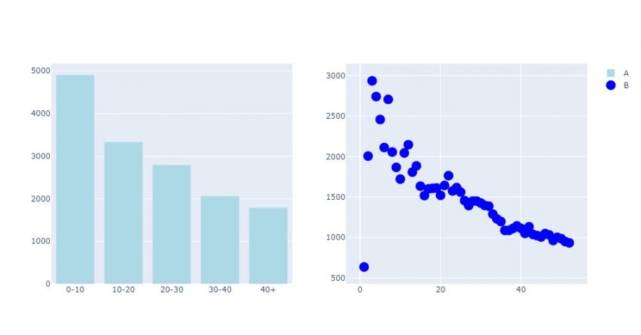
Finally, it can be really very useful when the scales are too different, for example to display different graphs in the form of grids. Once again Plotly is very effective in this exercise. All you have to do is create a subplot object using make_suplot, define the dimensions of the grid, then assign visualizations to it:
fig = make_subplots(rows=1, cols=2)

fig.add_bar(x=gpr_age["age"],
                y=gpr_age["rooms"],
                marker=dict(color="LightBlue"),
                name="A",
                row=1,
                col=1)

fig.add_scatter(x=agg_age["age"],
                y=agg_age["population"],
                marker=dict(size=15, color="Blue"),
                mode="markers",
                name="B",
                row=1,
                col=2)

fig.show()
Plotly is definitely a rich and easy-to-use library. Obviously impossible not to ask the question Plotly or Matplotlib? On the rendering side, capacity and complexity I would say that there is no photo as plotly allows to create more advanced visualizations. On the simplicity side? may be a slight advantage with Matplotlib, and more! In terms of integration, popularity and “standard” we can find everywhere (historical reason) Matplotlib.