
 by
by The Python matplotlib library is a library that allows you to do 2D data visualization in an extremely convenient way. It is not essential, of course, but when approaching Machine Learning projects it can be very practical. The objective of this tutorial is to get you started with this famous bookstore.
Note: This library comes with the Anaconda distribution.

There are many types of graphs supported, so I won’t detail them all in this tutorial. just remember that this library covers many types of graphs: lines, curves, histograms, points, bars, pie chart, tables, polars, etc.
This tutorial will explain how to make curves and histograms, for others I suggest you go see the documentation on the official site here .
For the dataset used, it’s simply that of the titanic on Kaggle.com: train.csv .
Index
Draw curves
To begin with, you obviously have to declare the Python library with the import command. By usage we choose the alias plt. We take the opportunity to retrieve the data set that we will limit to the first 5 lines in order to have readable graphs (for this tutorial):
import pandas as pd import matplotlib.pyplot as plt
titanic = pd.read_csv("./data/train.csv")[:5]
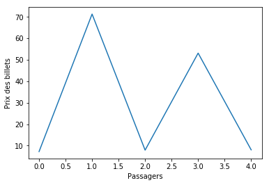
Labels on the axes
Adding labels is done via the xlabel and ylabel commands:
plt.ylabel('Prix des billets')
plt.xlabel('Passagers')
plt.show()
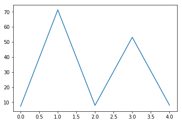
We get :
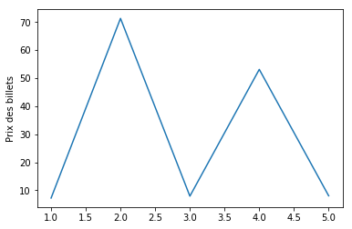
Assignment of abscissa data
So far we have only given values on the ordinate, let us specify the values on the abscissa (passenger number):
plt.ylabel('Prix des billets')
plt.xlabel('Passagers')
Stacking lines
Now it is often useful to stack curves in order to better analyze the data, it’s very simple with matplotlib by stacking the calls to the plot function:
plt.plot(titanic.PassengerId, titanic.Fare)
plt.plot(titanic.PassengerId, titanic.Survived)
plt.plot(titanic.PassengerId, titanic.Age)
plt.ylabel('Prix des billets')
plt.xlabel('Passagers')
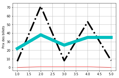
Here is the result of the 3 lines on the same graph:
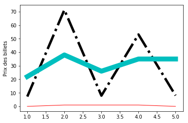
Change visual
Once again the library makes our life easier and allows us to change color, line or line thickness in the blink of an eye simply by specifying options in the call to the plot function:
Here are the codes / options available:
- Curve Codes: – or – or -.
- Color codes: bgrcmykw
- Line width with linewidth
plt.plot(titanic.PassengerId, titanic.Fare, "k-.", linewidth=5)
plt.plot(titanic.PassengerId, titanic.Survived, "r", linewidth=1)
plt.plot(titanic.PassengerId, titanic.Age, "c", linewidth=10)
plt.ylabel('Prix des billets')
plt.xlabel('Passagers')
the result :
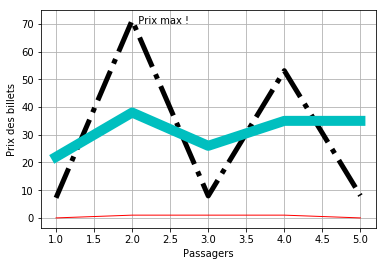
Add a grid
Simply by adding a call to the grid () function:
plt.grid(True)
Voilà le résultat:
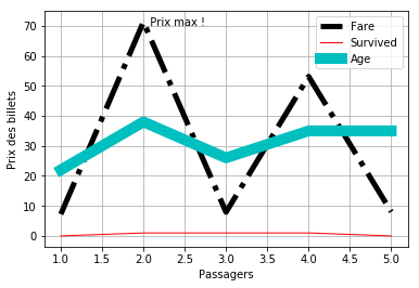
Do more in your graph
The matplotlib library has several functions for this:
- text () and annotate () for adding text in the graph (for example, let’s add a point specifying the maximum price)
- legend () to add the legend
- etc.
plt.text(2,70, '  Prix max !')
plt.legend()
The result :
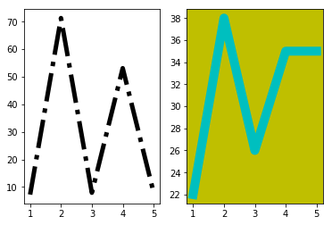
Create graph grids
Just as it is possible to stack several curves in the same graph, it is possible to create graph grids; This is very practical for stacking graphs which must be looked at together but which do not have the same orders of magnitude in terms of abscissa and ordinate. To do so, we use the subplot () instruction which will describe the grid. This command takes multiple arguments;
- Number of lines of the graph
- Number of columns in the graph grid
- Index of the graph in the grid
- Options (here we have specified a background color)
In the example below we define a grid of 1 column and 2 rows:
plt.subplot(1, 2, 1)
plt.plot(titanic.PassengerId, titanic.Fare, "k-.", linewidth=5)
plt.subplot(1, 2, 2, facecolor='y')
plt.plot(titanic.PassengerId, titanic.Age, "c", linewidth=10)
Note: we also specify that the second graph has a yellow background
Here is the result:
Some other diagrams available
Histogram
The histogram is a very practical graph because it presents you in cumulative (automatic) your data set. This is very useful for example to see the distribution frequencies of your values:
plt.hist(titanic.Fare)
Warning: this function does not work if you have character type labels (abscissa). To remedy this, use the bar () function by performing the count “manually”.
You can look at these two Python functions as an example implementation on Gist:
Simple histogram
# Where matplotlib do not work (when using string labels for hist())
from collections import Counter
def hist_string(df) :
    distincts_count = Counter(df)
    df = pd.DataFrame.from_dict(distincts_count, orient='index')
    df.plot(kind='bar')
hist_string(titanic.Embarked)
Double histogram
# The goal here is to create a double histogram with string labels which is not supported yet with the hist() matplotlib function

import matplotlib.pyplot as plt
import numpy as np
from collections import Counter

# Dead list
l1 = titanic[titanic["Survived"] == 0]["Embarked"].dropna()
# Survivor list
l2 = titanic[titanic["Survived"] == 1]["Embarked"].dropna()

# draw histogram function
def hist2Str(_l1_Values, _l2_Values, _l1_Label, _l2_Label, _X_Label, _Y_Label):
    step = 0.3
    # Values lists 1 & 2
    count1 = Counter(_l1_Values)
    counts1 = count1.values()
    count2 = Counter(_l2_Values)
    counts2 = count2.values()
    # Labels in x
    labels = count1.keys()

    # Draw histogram
    bar_x = np.arange(len(counts1))
    plt.bar(bar_x, counts1, step, align = 'center')
    plt.bar(bar_x + step, counts2, step, color='r', align = 'center')
    plt.xticks(bar_x + step/2, labels)
    # Axis labels & draw
    plt.ylabel(_Y_Label)
    plt.xlabel(_X_Label)
    plt.legend([_l1_Label, _l2_Label])
    plt.draw()
hist2Str(l1, l2, "Dead", "Survived", "Embarked", "Passenger")
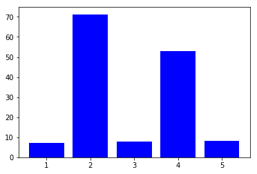
Bar chart
Visually it is a histogram, but except that as for the curves (above) it is you who specify the data (abscissa and ordinate):
plt.bar(titanic.PassengerId, titanic.Fare, color="b")
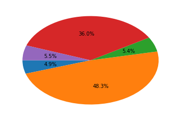
Pie chart
Very useful to visualize the share of each data on a “finite set” (like percentages):
plt.pie(titanic.Fare, autopct='%1.1f%%', startangle=180)
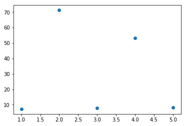
Scatter
To simply place point distributions :
plt.scatter(titanic.PassengerId, titanic.Fare)
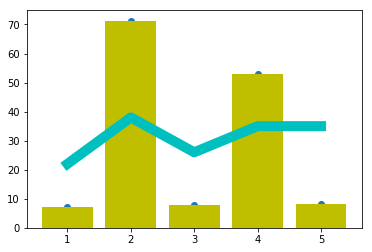
Cumulate diagrams into one
As we saw previously, it is now sufficient to stack the calls to plot (), scatter (), bar (), etc.
plt.scatter(titanic.PassengerId, titanic.Fare)
plt.bar(titanic.PassengerId, titanic.Fare, color="y")
plt.plot(titanic.PassengerId, titanic.Age, "c", linewidth=10)
Summary
The matplotlib documentation is available here .
Summary of diagram functions in this tutorial:
- plot () : to plot curves
- scatter () ; to plot points
- bar () : for bar charts
- pie () ; for camenbert
- hist () ; for histograms


One thought on “The Matplotlib library”