 by
by You do not know Tableau ?
Why not start by discovering the product by downloading the trial version (Desktop) here and then trying it… like that, without training… nothing! You will see it is an extremely intuitive tool and which will allow you in a few clicks to produce amazing Viz.
But what exactly is a Viz?
A Viz is quite simply a way of visualizing data.
Easy to say but not that easy to do. Indeed, creating graphs to reflect data is not always so easy. Make a bar graph, curves, pie charts, etc. and consolidating all of this into a dashboard isn’t always easy. Hence the interest ofTableau which is aimed at users (Analysts, Data stewards, Data scientists, etc.) to allow them to better understand and simply see their data.
I will not in this article (at least not yet) describe how to create a Viz or a dashboard but just present my first one. Don’t worry I will be doing a long series of articles later on using Tableau and especially on tips and tricks.
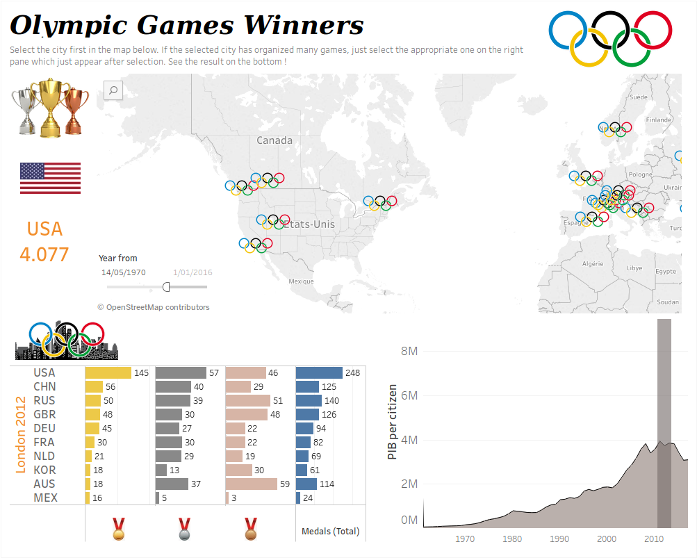
Here is my first dashboard:

Dashboard Tableau on the results of the Olympic Games
You will be able to access and use it (because it is of course dynamic) on Tableau Public: https://public.tableau.com/profile/caylabenoit#!/vizhome/2018_3_JO_v2_5/Rsultats
This Dashboard is made up of 3 main sections (+ 1 contextual section):
- The map at the top shows the cities that hosted the Olympics
- At the top left we will have the country which has collected the most gold medals (according to the selected Olympics of course)
- At the bottom left we have the winners of the selected Olympics
- At the bottom right we have for the organizing country the GDP (a gray band shows the period of the Olympics)
To use it, nothing could be simpler. First click on a city on the map. Then a mask section must appear proposing for the city the list of Olympic Games that it has organized (by year). For example, London has organized the Olympics 3 times, we will have a list with the 3 years concerned. Select the desired year and watch the bottom flaps cool down.